How might we make student insights more meaningful?
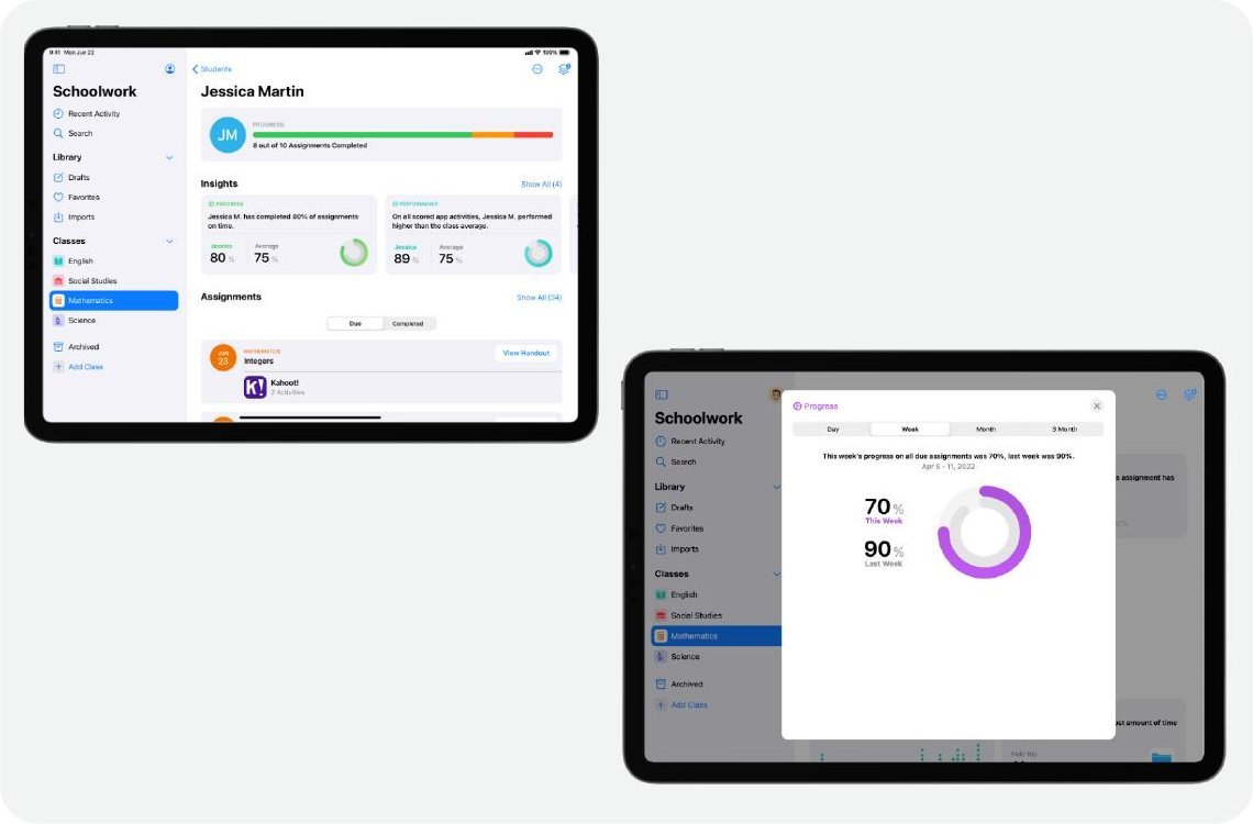
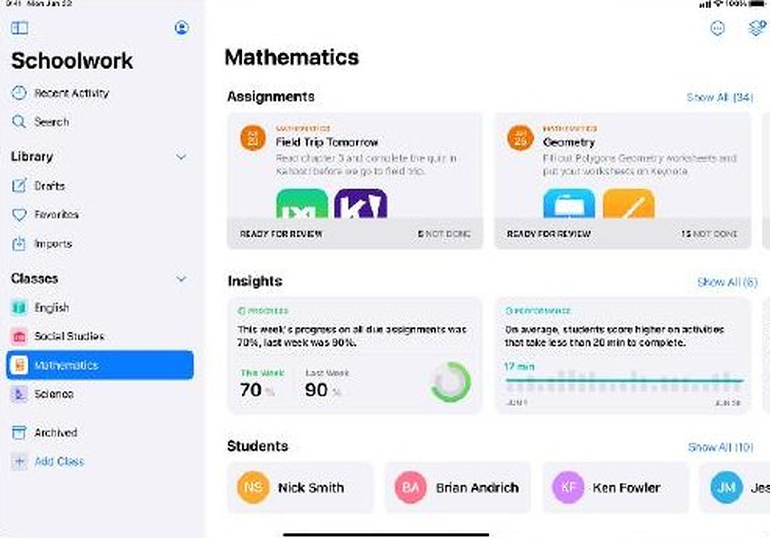
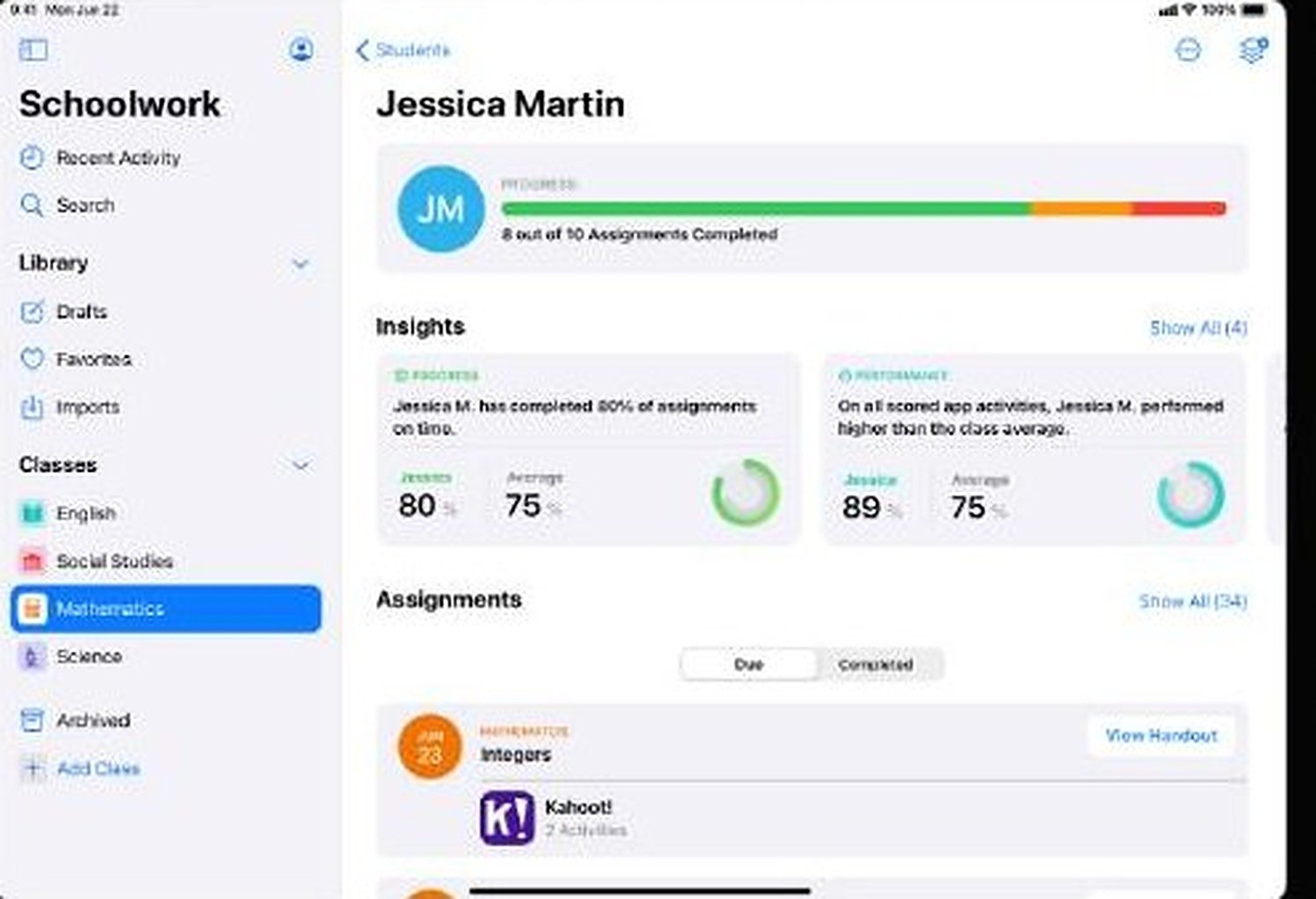
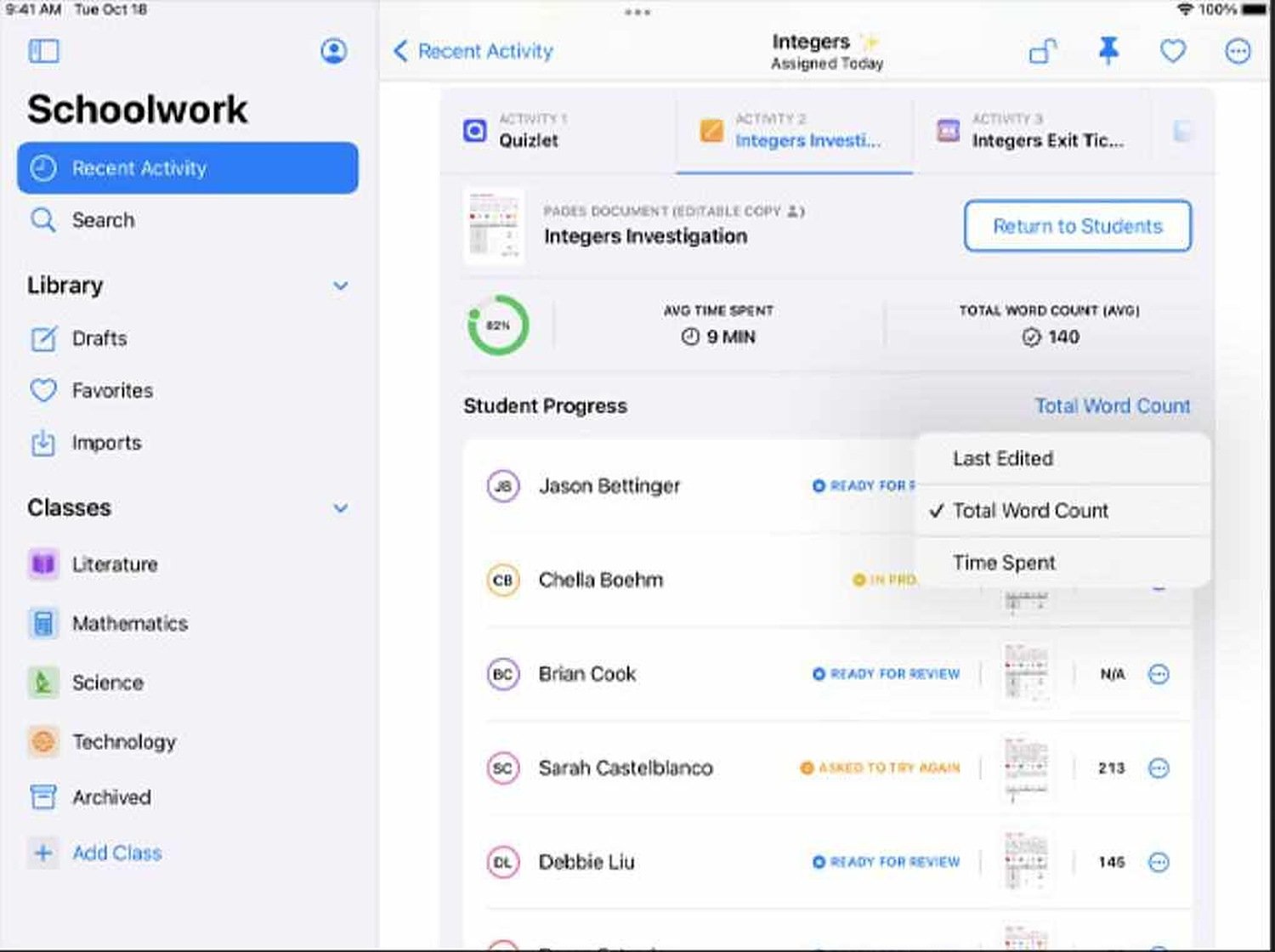
Teachers need a platform that pulls formative and summative data from many sources so they can see the class at a glance and dive into an individual student or a time period when something looks off.
Data without direction
Teachers could see scores but not what to do next. They wanted to find outliers quickly, see trends over time, and act without leaving the app.
- Only 2 designers on the project
- UI had to scale to future Apple Education tools
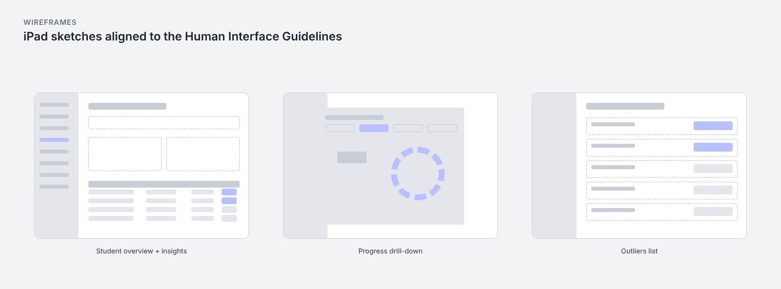
- Strict alignment with the Human Interface Guidelines
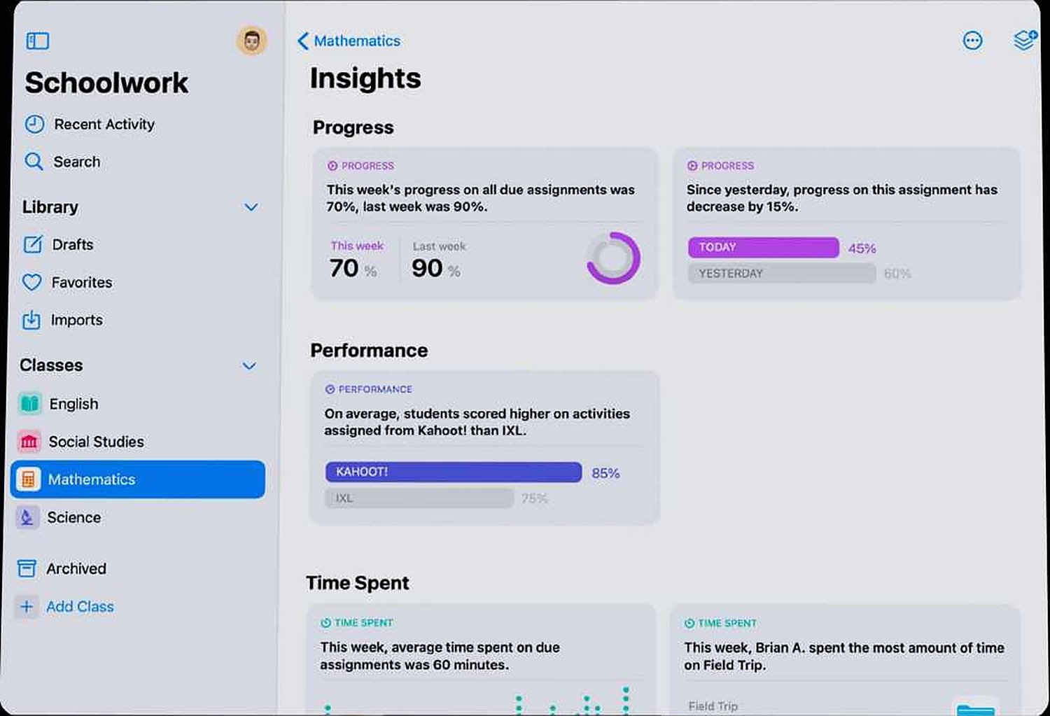
Insight cards that open into answers
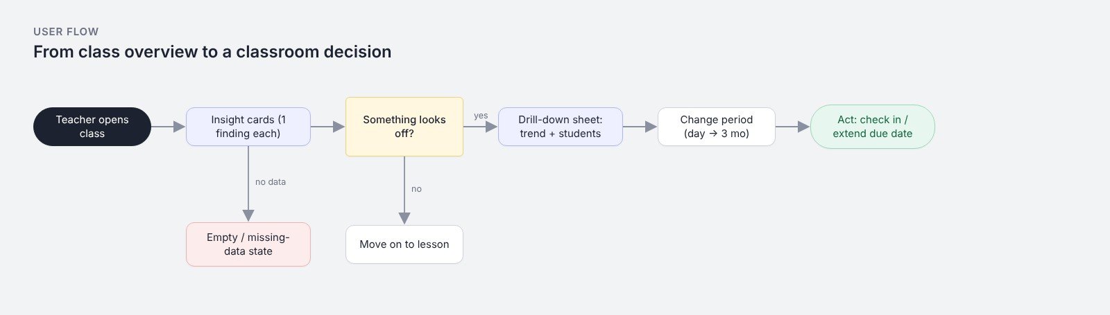
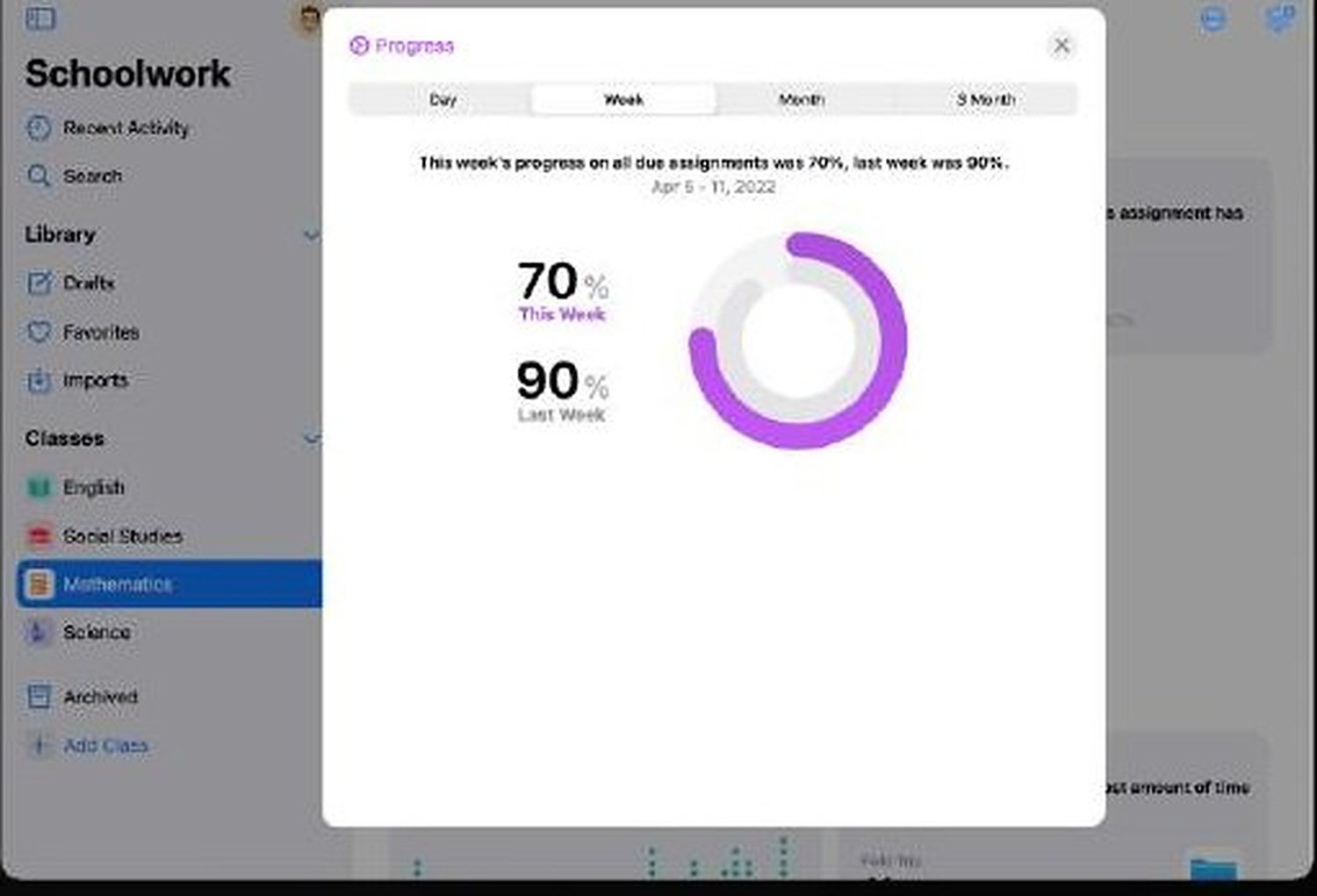
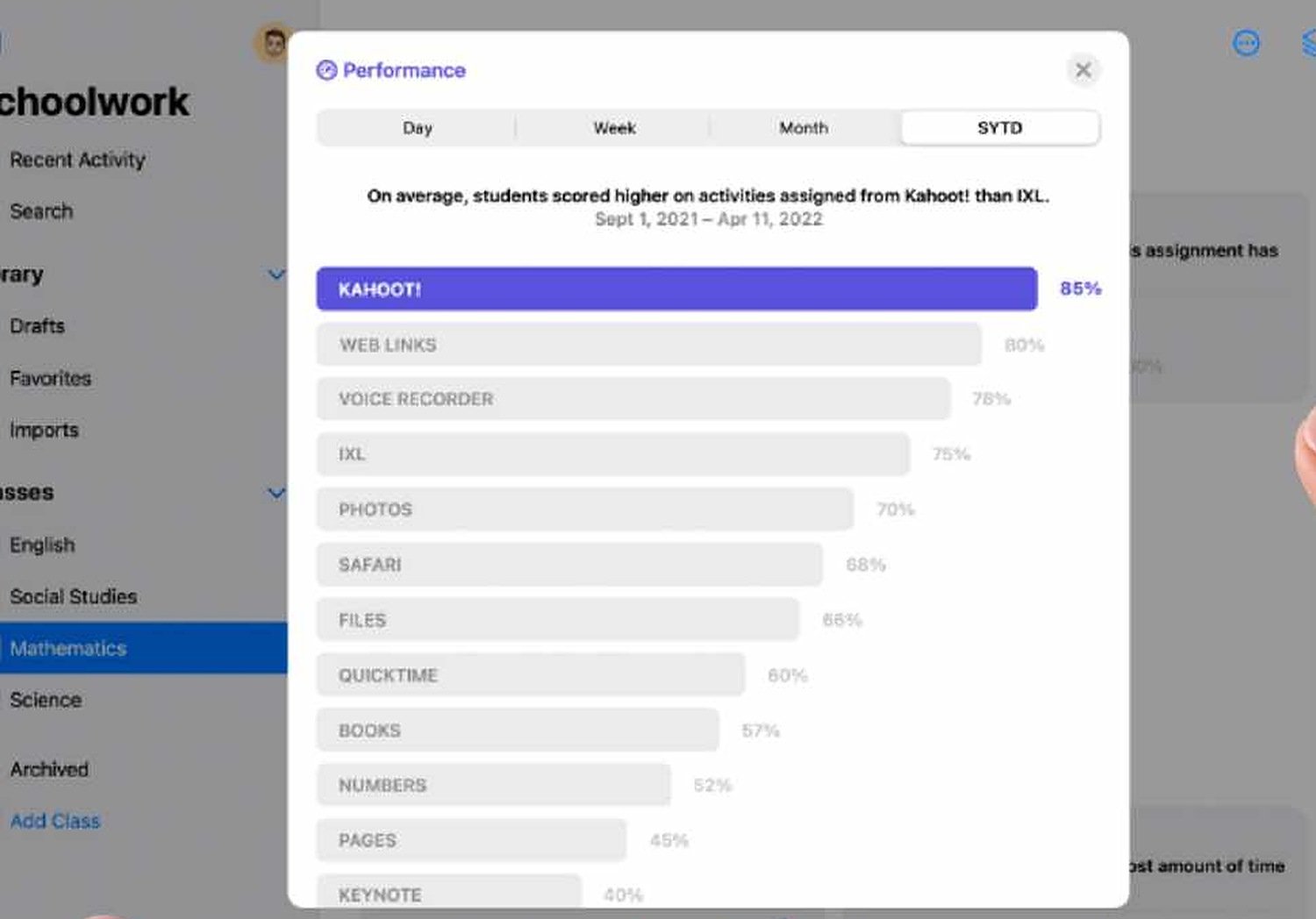
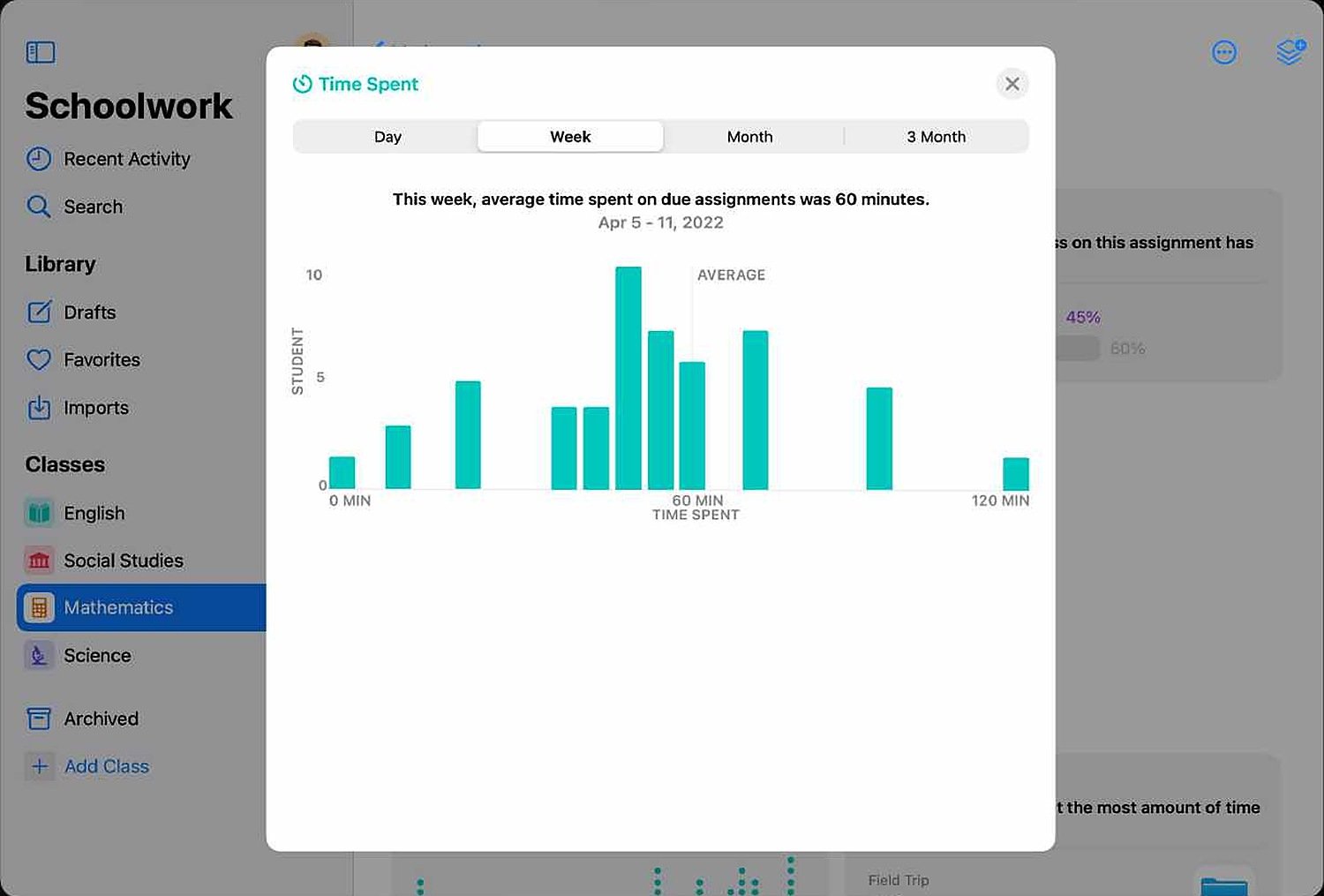
Each insight card states one finding in a sentence (progress, performance by app, time spent) with the comparison that gives it meaning. Tapping opens a drill-down sheet with the chart, the students behind the number and a next step such as checking in or extending a due date. I designed for the empty class, the outlier and the missing-data case, not just the happy path.
Faster decisions in the classroom
Testing showed teacher decision time fell by 45%. The data-visualisation patterns and reusable components shortened developer onboarding.
Ownership in a confidential environment
Working in a small, confidential team taught me to own decisions end to end and to collaborate closely with engineering when there is no room for long review cycles.