The insight is only useful if it fits the visit
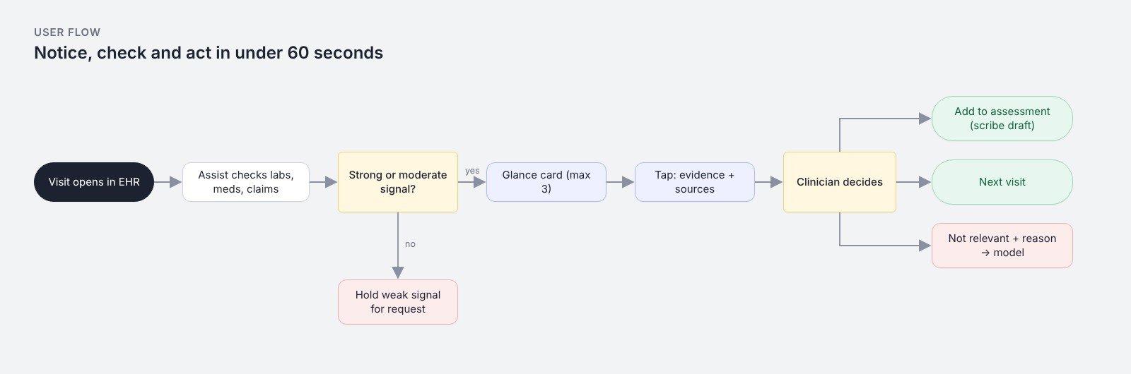
In a 15-minute visit a clinician can't read a report. The design question was how to surface a possible undocumented condition, such as early kidney disease hiding in lab trends, so it is noticed, checked and acted on in under a minute.
Glance, evidence, decide
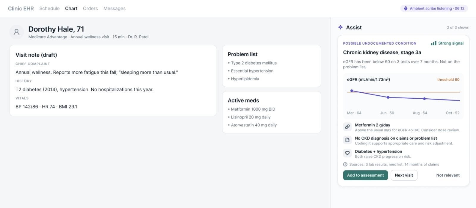
A side-panel card states the finding in plain words with a confidence label (strong, moderate, weak) instead of a percentage. One tap shows the evidence: the lab trend against its threshold, relevant medications, and the claims gap, with sources listed. Accepting writes the assessment into the ambient-scribe draft for the clinician to confirm. Dismissing takes one tap and a reason, which feeds back into the model.
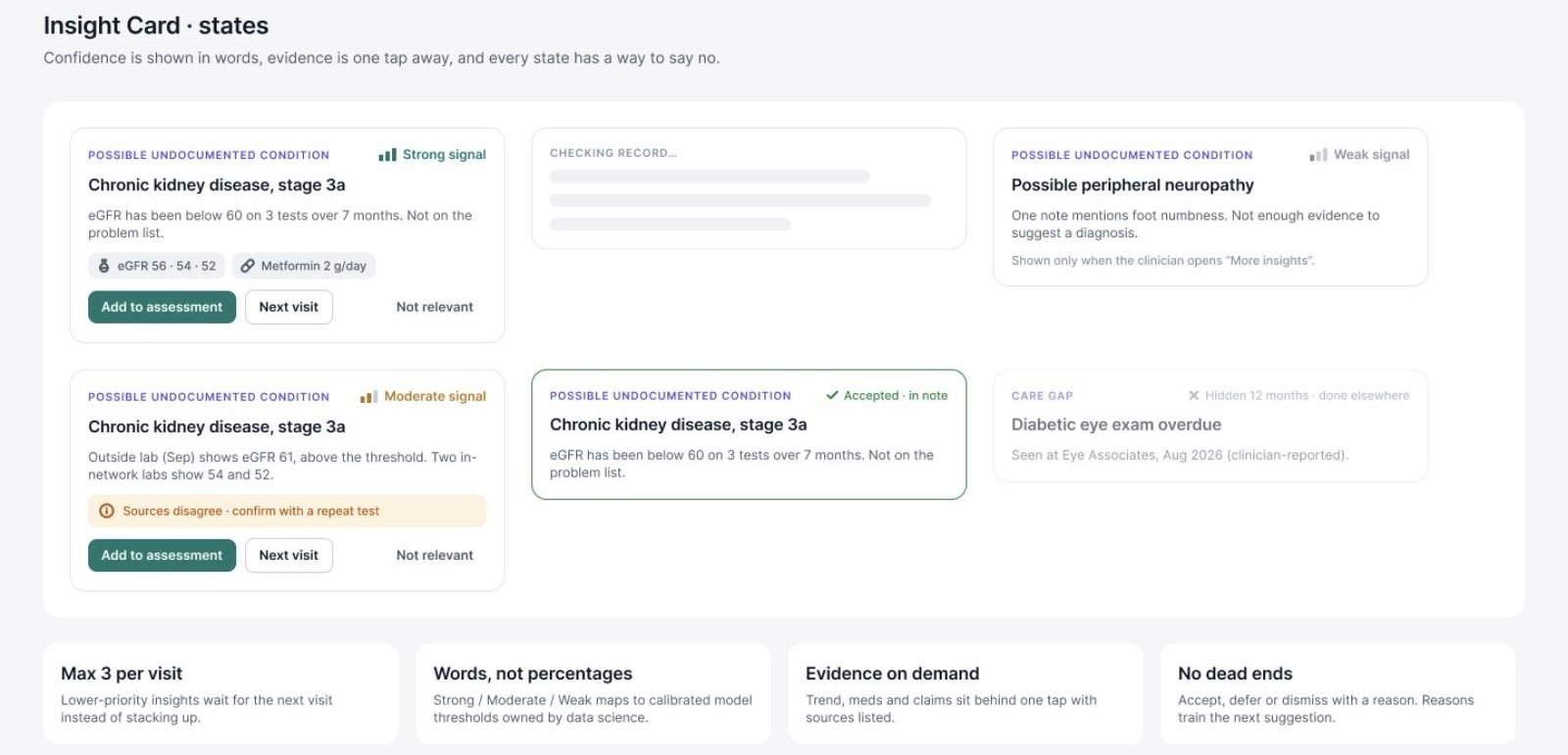
One component, six states
I built the Insight Card as a component set: glance, loading, weak signal, conflicting data, accepted and dismissed, with rules for when each appears (max 3 per visit, weak signals only on request, never blocks charting). Empty and partial-data states say what was checked and what a delayed source limits.
Measure the cost, not just the accuracy
The wrap-up screen shows how many seconds Assist added to the visit. An AI feature that is right but slow will be switched off, so time cost belongs next to acceptance rate on the quality dashboard.